I love colour negative film as it provides me with extraordinary flexibility that can cope with anything I chuck at it, which is just as well as in many places I visit where I live you can often encounter all four seasons in one day as the old saying goes. It can be used to capture high key scenes with huge dynamic range all the way through to those with low contrast with delicate tonality.
I can also, by judiciously adjusting the exposure of some of these films like Portra, achieve different looks from the same film stock from high saturation mimicking the "chrome" slide films of yore to soft subtle pastels for a more aesthetic look depending on the nature of my subject.
I use centre weighted average exposure as the basis of my metering and just move up and down from there using exposure compensation (+/-) according to the brightness of the scene/subject and the desired response I which to get from my film. I am aided and abetted in this by the fact that all of the rangefinder cameras I use have a similar metering system which read light reflected directly off the metal shutter blades which have a grey strip in their centre.
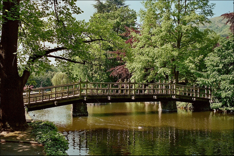
So let's talk exposure. In the topmost picture of the bridge taken on Ektar 100 I metered for the subject at box speed. The scene is evenly lit and Ektar does not have the wide exposure latitude (in this case 2 stops under and 1 over) of films like Portra so I always expose for mid tones or one stop over for shadows in more contrasty scenes and let everything else take care of itself. Ektar has already has bold colours that, coupled with high sharpness, ultra fine grain and neutral contrast with make make it ideal for landscapes. It's a film best used in bright daylight.
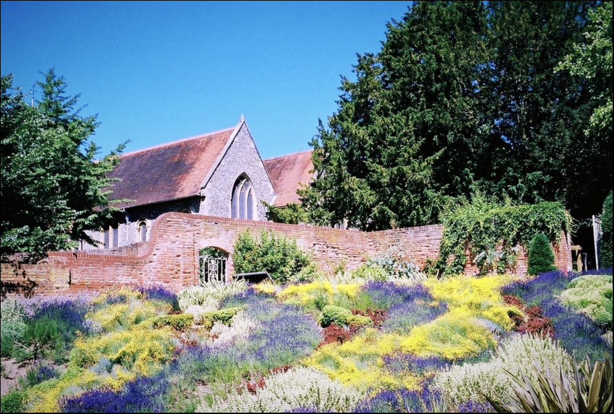
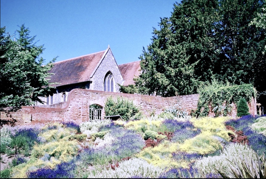
The two images with church in the back ground and the heather in foreground were taken on Portra 400 in the midday sun. The first was taken at ISO 400 (box speed) and gives results typical of a film with colour palette designed for portraiture. The second was snapped immediately afterwards with one and a half stops of overexposure. Portra 400 gets more contrasty and vibrant when it’s overexposed with colours becoming more saturated and more akin to how I saw them at the time.
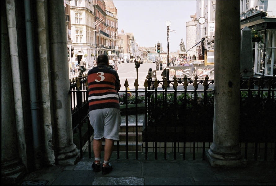
Finally here is a photo of a very high contrast scene where I metered for the subject, dialled in two stops of extra exposure to bring out the shadows, then simply relied on the wide exposure latitude of Portra 400 and the roll off the top of the S curve to prevent cut off of the highlights at the top end of the exposure. It is really impressive what this medium can do.
This is just a glimpse into the extraordinary flexibility of colour negative films like e.g. the Portra range; I encourage you to try them, experiment with them and explore their capabilities. They're quite remarkable.