A fun thing to do, from time to time, is to make a set of photos that are composed predominantly of a single vivid colour and tones thereof maybe. A sort of photographic colour tone poem in many ways.
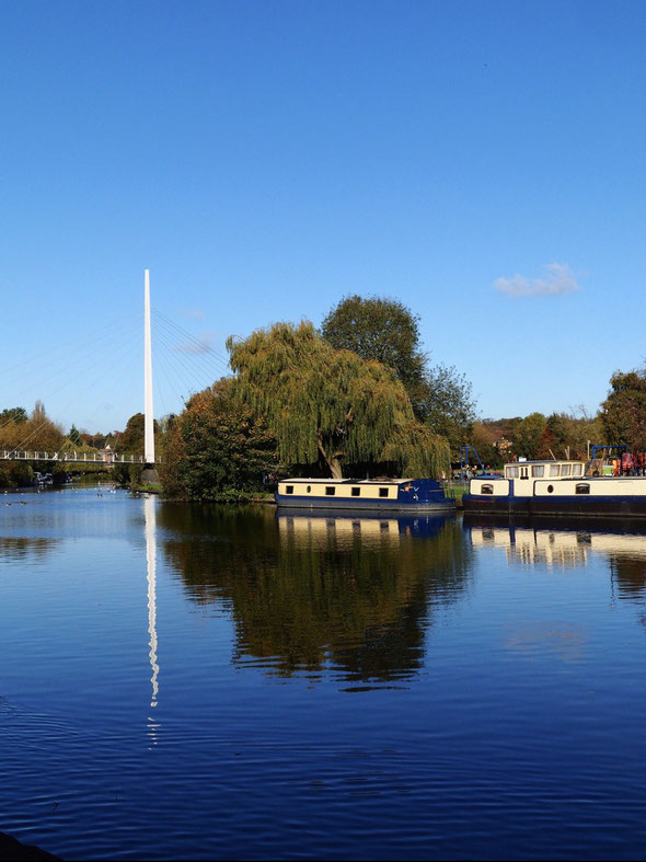
My choice of colour for this set was made for me on this particular day, blue from the blue skies reflected in the water of the river, deep blue.
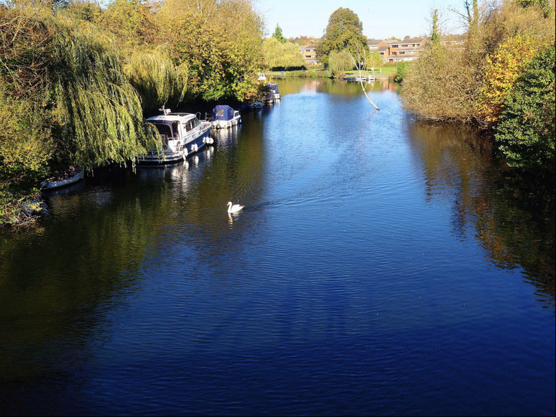
To enhance the colour I set the colour profile on the creative dial on the front of my Pen-F to the 'Color' profile control which was pre-set to the 'Vivid' picture mode.
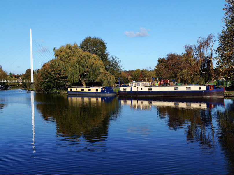
I then set about choosing scenes with large expanses of blue in them, adjusting the exposures where necessary to bring out the deeper tones.
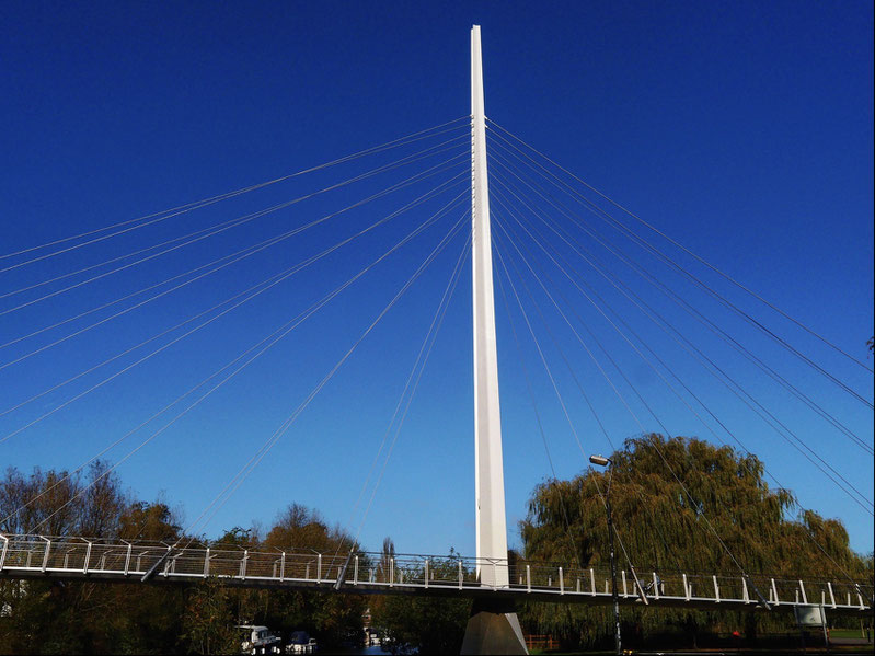
I also placed objects in the frame with hot colouring, like tones of whites and reds, to provide contrast with the deep blue and emphasise its dominance. Finally, I did no post processing of the images whatsoever having worked hard to get them exactly how I wanted them in the camera when I made them.
There you have it, 'A Study in Blue' - sample images from which may be found here.